In the previous installment of our “Don’t NOT Talk About Features” series, I highlighted the dangers of overcorrecting when rewriting feature messaging. Oftentimes, when PMMs rewrite a company’s messaging, they’ll go too far in the direction of talking about features only in reference to their benefits.
For example, with website copy specifically, TrustRadius found that 74 percent of B2B buyers would describe the language most software vendors use to describe their product as “a lot of fluff,” or “meaningless jargon.”
To avoid overcorrecting and turning business outcomes and benefit messaging into meaningless fluff, PMMs must be acutely aware of these three points:
- Business outcomes are literally unbelievable without the features to back them up.
- Feature descriptions need to be both accurate and detailed.
- Features need to be talked about in the right context, not in a big list.
The Right Context for Your Feature Messaging
When it comes to when and where to use feature messaging, it’s all about context: presenting the right messages to the right person at the right time. Throwing up features on your website in a big list isn’t going to cut it. Most people aren’t visionaries or early adopters who can envision which of their problems you can solve just by looking at your feature list.
If you do talk about features in isolation, out of the context of benefits, problems, and business outcomes, you often leave people feeling like this respondent:

Now, this person is obviously not in the early adopter crowd, but they are in the majority. We must remember that until you give them a reason to, most people won’t care about your features. However, when you talk about features in the right place at the right time, it works for both the visionaries and pragmatists alike.
How to Find the Right Context for Your Feature Messaging
How do we find the right context for feature messaging instead of relegating feature descriptions to a big list on a web page? Or instead of only talking about features in your documentation?
Whenever the next logical thing your audience wants to know is: “How?”
- How am I going to solve that problem with your product?
- How is your product going to give me that benefit?
And when you answer these questions with features, only talk about the features that are contextually relevant to the benefit, problem, business outcome that triggered the question. If you just direct them to a generic product or feature page, you’re putting the burden on your audience to connect the dots on their own.
Examples: Feature Messaging + Right Context
Rather than continuing to talk about this at a theoretical level, let’s look at some examples of companies that do this well.
Product Pages – ex. HubSpot
HubSpot provides an excellent example of how to include your features within a product page that’s less focused on the features themselves and also contains a lot of benefit messaging.
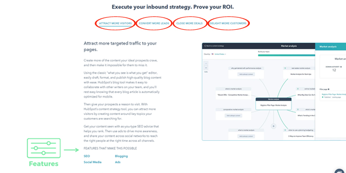
They have one section on their product page that allows you to see a few different benefits (red circles): attract more visitors; convert more leads; close more deals; delight more customers. Each one of those tabs provides a few paragraphs describing that main benefit.
Notice just underneath, they include the features that make the benefits possible. When you click on any of the features (SEO, blogging, social media, ads), it takes you to a page with a full description of that feature.
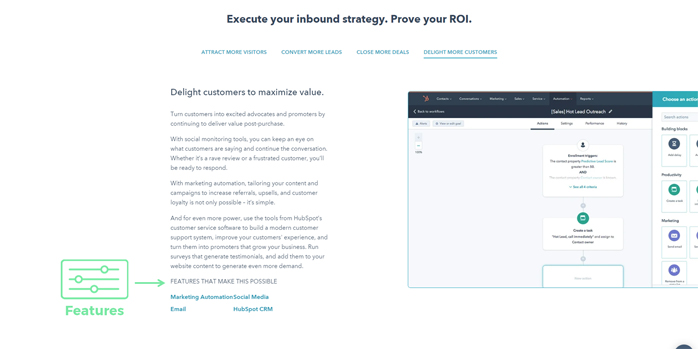
Here’s another really cool thing HubSpot does that I think is really important. Let’s look at another one of their benefits: delight more customers.
Use Case Pages – ex. Hootsuite
One company that successfully includes feature messaging in its use case pages is Hootsuite. They use a similar layout to HubSpot’s product page on their solutions pages.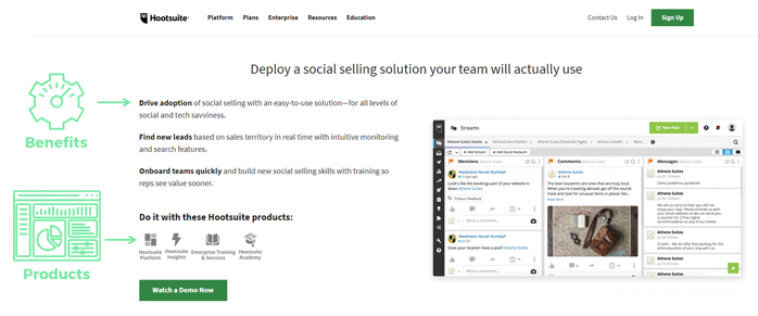
Use Case, Industry, & Persona Pages – ex. Auth0
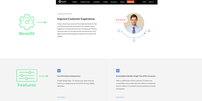
Another company I’ve found that does use case, industry, and persona-focused pages particularly well is Auth0. They display multiple sections on the page that include a benefit, a description of the benefit, and a list of the features that provide that benefit.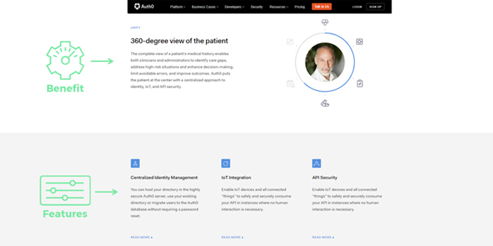
Pricing Pages – ex. Monday.com
Monday.com is an example of a company that does particularly well at including features within pricing pages.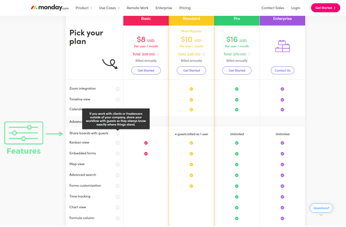
When you visit their pricing page, you’ll notice there’s a little tool tip icon next to each individual feature listed. These bring up short descriptions of what that feature is or it explains a benefit that specific feature provides.
Most people who’ve made it to the pricing page have probably read through several of your website pages and have seen features mentioned throughout that process. They may not, however, actually know which ones they need.
These tool tips are incredibly important for people trying to understand what’s included in each one of your pricing packages (i.e. which features they’re going to get with that). If visitors can see feature descriptions right there, then they don’t have to flip back and forth between the pricing page and product/use case/feature pages to remember each feature and what it provides. Since the information is right there, pre-purchase friction is significantly reduced.
“No one cares about your features…”
Another thing people say besides, “Don’t talk about features, talk about benefits (or whatever),” is, “No one cares about your features, they care about solving their problems.” And this is probably true most of the time.
But sometimes, people’s problem is that they’re your user or customer and they’re waiting for you to add a feature to the product. In that case, they care a lot about your features. Ergo, feature announcement posts are especially useful for your users.
Feature Announcement Posts – ex. Elegant Themes
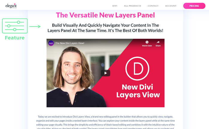
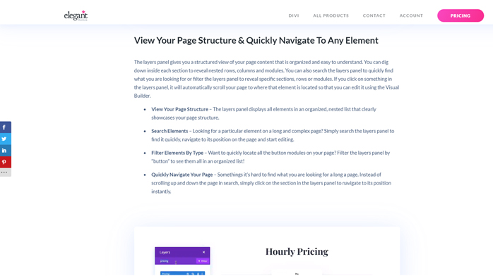
One company that does an amazing job with feature announcements is Elegant Themes, who produce the Divi Theme for WordPress. They have some really ridiculously amazing announcement posts that they create for a lot of their new features.
Features Page – ex. FullStory
If your management team is really gung-ho about making sure there’s a feature page that includes the entire list of features, take notes from FullStory. They break down the actual features into capabilities.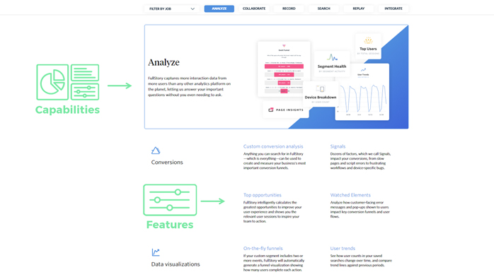
The displayed features all roll up to an overall capability: analyze, collaborate, record, search, replay, and integrate. Each one of those capabilities breaks down into a number of features below it, each section of features has a little feature category that goes along with it, and each feature has its own description along with that!
FullStory also allows people to filter out which features are most relevant to them, which is great. Visitors can indicate their role (customer support, product management, marketing, etc.), and it’ll filter the list of features that are on that page down to the ones that are relevant for that specific role.
I found this to be really cool because usually you’ll see some pages that are broken out individually by role (which is nice). But if you’re forced to do an entire feature list like this, including that kind of filtering makes a huge difference.
Most times when we produce persona-focused or role-focused pages, we end up at the benefit level and don’t end up listing all the features that would be included in a master feature list.
How to Erase Doubt Around Feature Messaging Context
If you ever have any doubt about when and where to use feature messaging, especially functional feature messaging, think about it like this: does the user/prospect
have enough information to be able to believe the other things that you’ve said there?
- If you mentioned a bunch of benefits…
- If you mentioned a bunch of business outcomes…
- If you mentioned some problems that you’re claiming your product can solve for them…
Do they have enough information to believe it right then and there?
And of course, it doesn’t hurt to have some social proof there as well. If you have user reviews or testimonials from users claiming that they’ve received this business value, reaped these benefits, and used your product‒fantastic! Obviously use them, but also be aware that most buyers suspect you’re cherry-picking the best ones and will seek to verify the info for themselves.
The objective proof is in the product. If written accurately, in detail, and without puffery, functional feature messaging provides concrete proof of what users can expect the product to do for them before they even try it.
Series Summary
To sum up this series by modifying the common refrain that inspired it:
- Don’t talk about features OUT OF CONTEXT.
- Talk about features as they relate to the problems you solve, the business outcomes you deliver, and the benefits your product provides.
- Tell the full story by clearly connecting the dots for your audience.
Review the rest of our “Don’t NOT Talk About Features” series here:
